|
|
 |
Italicized links open a new window to an external site
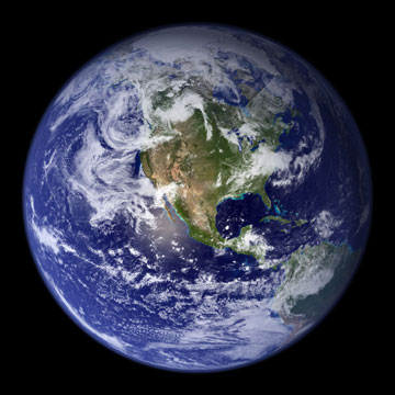
The World in a Room
Here is a way to get students to understand world population statistics, and a bit of geography to boot. You may use other topics too. If you're looking for information about specific nations and global issues, try The CIA World Factbook or World Audit.
For those with classes made up of greater or fewer than 35 students, I have created this Microsoft Excel workbook. With it you can enter the number of students in your class (or other group), then immediately see how that group would depict the statistics in the population, language, religious affiliation, income and age tables below. It also contains additional worksheets with updated world population and religious affiliation tables. To save the workbook file, right click on its link above then choose Save Target As and specify the location to which you want it saved. You may also click on the file's link. If you have Quick View+ installed on your computer, you will see an error message; choose the Save option it gives you, then save the file to a folder on your hard drive from that window. If you do not have this viewing program installed, a small window should open. One of the options presented should be to save the file. Click on that option. You should then be prompted to specify where on your hard drive you want to save the file. Put it in the folder where you save and open Excel spreadsheets. Once the file has completed downloading, the small window will close on its own.
Instructions
- Africa - 13%
- Asia - 60.7%
- Europe - 12.1%
- North America - 7.9%
- South America - 5.7%
- Oceania - 0.5%
- 5 Africans (4.55 rounded up)
- 21 Asians (21.245 rounded down)
- 4 Europeans (4.235 rounded down)
- 3 North Americans (2.765 rounded up)
- 2 South Americans (1.995 rounded up)
- 0 Oceanians (0.175 rounded down)
- where their initial estimates were off, and what might have caused them to be so.
- what nations make up each group.
- whether an average person would know this sort of information based solely on exposure to mass media (TV, movies, radio, newspapers, magazines, etc.).
Here is a link to the relevant table in the Information Please Almanac Online. If you compare the information in this table (at least at the time I write this) with that in the World Almanac table below, you'll notice some relatively minor differences. They probably stem from the fact that the two tables are based on different sources. The World Almanac table is based on U.S. Census Bureau data, while the Information Please Almanac data comes from the National Geographic Society. This is another example illustrating the reasons we need to learn processes rather than memorize answers.
The World Almanac and Book of Facts 2000 shows the following in a table on page 878.
| Continent or Region | Area (millions of square miles) | % of the Earth | World population % (1999) |
| North America | 9.4 | 16.2% | 7.9% |
| South America | 6.9 | 11.9% | 5.7% |
| Europe | 3.8 | 6.6% | 12.1% |
| Asia | 17.4 | 30.1% | 60.7% |
| Africa | 11.7 | 20.2% | 13.0% |
| Oceania | 3.3 | 5.7% | 0.5% |
| Antarctica | 5.4 | 9.3% | 0% |
If this works well, try it again with a different topic.
| Languages | Religions | Income | Age distribution | Fact checking | top of this page |
Begin by asking your students to write down what they believe are the 10 most common languages spoken in the world (#1 being the most common, #2 the next most common, etc.). (If 10 is too many for your class, ask them for the most common 5, or even the most common alone.) Then ask them to decide what percentage of the world's population speak each, and how many students in the class would represent that percentage. Go on to lead a discussion where you attempt to reach a class consensus on what should be on the list, the percentage of the world population speaking each, and the number of students in the class representing those percentages. Once you've reached a consensus, or given up trying for one, share the information in the following table with your class. It is based on data published by Ethnologue. (Thanks to Pam Echerd for help in properly using Ethnologue's data.)
The number of speakers shown for each language includes those for whom it is a Mother Tongue, as well as those who speak it as a second language. As the data is for 1999, I calculated the % of world population using 6,002,509,427, the estimated mid-year 1999 world population. The remainder of the world's population (14 students in a class of 35) speak more than 6,000 other languages.
Clicking on a language link will open a separate browser window with Ethnologue's most recent data for that language. Clicking on a country link will open a separate browser window with Ethnologue's most recent data about the languages spoken in that nation. If you want to update the table as newer data becomes available, you'll also need the most recent world population figures.
Ethnologue also presents a chart showing the geographic distribution of living world languages.
| Language | Home nation | Est. speakers (millions) | % of world pop (1999) | # in a class of 35 |
| Mandarin | China | 1,052 | 17.53% | 6 |
| English | United Kingdom | 508 | 8.46% | 3 |
| Hindi | India | 487 | 8.11% | 3 |
| Spanish | Spain | 417 | 6.95% | 2 |
| Russian | Russia | 277 | 4.61% | 2 |
| Bengali | Bangladesh | 211 | 3.52% | 1 |
| Portuguese | Portugal | 191 | 3.18% | 1 |
| Indonesian | Indonesia (Java and Bali) | 140 | 2.33% | 1 |
| German | Germany | 128 | 2.13% | 1 |
| French | France | 128 | 2.13% | 1 |
The list looks somewhat different when only those for whom a language is their Mother Tongue are counted. With this list, 18 students in a class of 35 would be left speaking humanity's more than 6,000 other languages.
| Language | Home nation | Est. speakers (millions) | % of world pop (1999) | # in a class of 35 |
| Mandarin | China | 874 | 14.56% | 5 |
| Hindi | India | 366 | 6.10% | 2 |
| Spanish | Spain | 358 | 5.96% | 2 |
| English | United Kingdom | 341 | 5.68% | 2 |
| Bengali | Bangladesh | 207 | 3.45% | 1 |
| Portuguese | Portugal | 176 | 2.93% | 1 |
| Russian | Russia | 167 | 2.78% | 1 |
| Japanese | Japan | 125 | 2.08% | 1 |
| German | Germany | 100 | 1.67% | 1 |
| Korean | Korea, South | 78 | 1.30% | 1 |
Begin by asking your students to generate a list of the top 10 religious denominations in the world. Then ask them to decide what percentage of the world's population belong to each, and how many students from the class would represent the world's population for each. The Information Please Almanac Online has a table showing the distribution of the Top Ten.
The following list is from the World Almanac and Book of Facts 2000 (page 695). It is based on the 1998 world population (5,924,574,901). The 1 remaining person in a class of 35 would be spread among the religions with 0 representation. Should you want to update the numbers, look at the statistics published by Adherents.com. When you plug the numbers you'll find there (along with the population total for the year those numbers represent) into the Religion - updated tab in the Microsoft Excel workbook I've created to use in conjunction with this page, you'll see immediate updates for the data in this section. To save the workbook file, right click on its link above then choose Save Target As and specify the location to which you want it saved.
| Religion |
Adherents (millions) |
% of world pop (1998) | # in a class of 35 |
| Baha'is | 6.764 | 0.11% | 0 |
| Buddhists | 353.794 | 5.97% | 2 |
| Chinese Folk Religionists | 379.162 | 6.40% | 2 |
| Christians | 1,943.038 | 32.80% | 11 |
| Confucianists | 6.241 | 0.11% | 0 |
| Ethnic religionists | 248.565 | 4.20% | 1 |
| Hindus | 761.689 | 12.86% | 5 |
| Jains | 3.922 | 0.06% | 0 |
| Jews | 14.111 | 0.24% | 0 |
| Mandeans | .038 | less than 0.01% | 0 |
| Muslims | 1,164.622 | 19.66% | 7 |
| New-Religionists | 100.144 | 1.69% | 1 |
| Shintoists | 2.789 | 0.05% | 0 |
| Sikhs | 22.332 | 0.38% | 0 |
| Spirtualists | 11.785 | 0.20% | 0 |
| Zoroastrians | .274 | less than 0.01% | 0 |
| Other religionists | 1.001 | 0.02% | 0 |
| Nonreligious | 759.655 | 12.82% | 4 |
| Atheists | 149.913 | 2.53% | 1 |
Begin by asking your class to figure out how many students would represent the percentage of those in the world living on an income of less than $2 per day. The World Bank tracks the numbers. Their tables provide percentages of population in the less developed world, so you'll have to use their numbers to calculate the percentages of the entire world population.
The 1998 World Bank data shows, conservatively, that 1.1749 billion people lived on less than $1 per day; while 2.8115 billion lived on less than $2 per day (this of course includes those living on less than $1 per day). The world had roughly 5.925 billion people in 1998. This means that 19.83% lived on less than a dollar a day; while 47.45% (almost half of the world population) lived on less than $2 a day. In a class of 35, that would be 7 and 17 respectively.
For comparison purposes, the Statistical Abstract of the United States 1999 gives the median per capita income for the U.S. in 1998 as $75 per day; and its population as 270,561,000. This means that, on average, residents of the U.S. (4.57% of the world's population or 2 in a class of 35) earned more than 37 times that earned by nearly half of the world's other residents.
Begin by asking your class to determine how many of them would represent the world population under 15 years old, from 15 through 59 years old, and 60 years old and older. The United Nations Development Programme tracks information such as this. Recent reports are available at http://www.un.org/esa/population/unpop.htm.
Their data for 1998 showed the following:
| Age range | % of world pop (1998) | # in a class of 35 |
| through 14 years old | 30% | 11 |
| 15-59 years old | 60% | 21 |
| 60+ years old | 10% | 3 |
In 2001, I received an e-mail in which the sender forwarded me the bolded message below. Doing a cursory web search, I determined that it appears to have been circulating on the web for some time. I've seen things like it in print for a couple of decades. In fact, it was one of them that prompted me to research, write and post this page. A famous one was prepared by Donnella Meadows as the back side of a poster commemorating the Rio Earth Summit in 1992. (Meadows co-authored the books The Limits to Growth and Beyond the Limits.) A very nice Flash presentation based on Meadows' numbers is now online at http://www.miniature-earth.com/ Thanks to Barbara Kingsley (@barbarakingsley on Twitter) for pointing it out.
The problem with messages like these is that sources for the numbers are not usually cited. Thus it is very difficult to try to validate or update them. Sounds to me like a good class project for students who know how to search the web. My attempt resulted in what you see above. Maybe your students can find sources to update some of the other numbers.
Addendum, May 4, 2002 - I've come across a treasure trove of links concerning the e-mail message below.
- with regard to its authorship, see the following
- an interview with David Smith, author of the recently published If the World Were a Village (Kids Can Press, 2002)
- a June 2001 article in Fast Company magazine on Phillip Harter, a Stanford professor who forwarded a copy of the message that inadvertently included his e-mail signature block beneath it, thereby convincing many people around the world that he was its author
- e-mail responses to the above article
- with regard to the validity of its assertions, do not miss
- Fast Company's sourced list
- Urban Legends' analysis
- Population Connection's (formerly ZPG) nicely formatted and sourced Acrobat PDF file (If you do not have the Acrobat Reader installed for your browser, you can download it at no charge.)
- Nations Online update of this message. To see it, open their world population page, then scroll down until you see the section titled, Summary of the World.
- For a visual depiction, see the Miniature Earth project at http://www.sustainer.org/dhm_archive/index.php?display_article=vn338villageed
If you want more fact checking ideas, be sure to review Is That A Fact?.
Here is the e-mail I received:
If Earth's population was shrunk into a village of just 100 people -- with all the human ratios existing in the world still remaining -- what would this tiny, diverse village look like?
57 would be Asian
21 would be European
14 would be from the Western Hemisphere
8 would be African
52 would be female
48 would be male
70 would be nonwhite
30 would be white
70 would be non-Christian
30 would be Christian
89 would be heterosexual
11 would be homosexual
6 would possess 59% of the entire world's wealth, and all 6 would be from the United States.
80 would live in substandard housing
70 would be unable to read
50 would suffer from malnutrition
1 would be near death
1 would be pregnant
1 would have a college education
1 would own a computer
The following is an anonymous interpretation:
Think of it this way. If you live in a good home, have plenty to eat and can read, you are a member of a very select group.
And if you have a good house, food, can read and have a computer, you are among the very elite.
If you woke up this morning with more health than illness ... you are more fortunate than the million who will not survive this week.
If you have never experienced the danger of battle, the loneliness of imprisonment, the agony of torture, or the pangs of starvation ... you are ahead of 500 million people in the world.
If you can attend a church meeting without fear of harassment, arrest, torture, or death...you are fortunate, more than three billion people in the world can't.
If you have food in the refrigerator, clothes on your back, a roof overhead and a place to sleep...you are richer than 75% of this world.
If you have money in the bank, in your wallet, and spare change in a dish someplace...you are among the top 8% of the world's wealthy.
If your parents are still alive and still married...you are very rare, even in the United States.
If you hold up your head with a smile on your face and are truly thankful ... you are blessed because the majority can, but most do not.
If you can hold someone's hand, hug them or even touch them on shoulder ... you are blessed because you can offer a healing touch.
If you can read this message, you just received a double blessing in that someone was thinking of you, and furthermore, you are more blessed than over two billion people in the world that cannot read at all.
Have a good day, count your blessings, Peace.
Be Happy & Don't Worry :-) :-) :-)
Warm-up activities
Which is largest, Greenland, South America or Africa?
What is the most common crime committed in the U.S.?
When a person dies at the hands of a gunman, who most often pulls the trigger?
Main Events
Media use survey from Propaganda in the classroom
![]()
return to the Main Events page
return to the Lesson Ideas page
copyright © 2000-2017
classroomtools.com. All Rights Reserved.
original web posting: Tuesday, December 12, 2000
last modified:
Wednesday, October 04, 2017